I switched to Apple when Microsoft released Windows 8. Apple's OS X still seemed civilized. This has come to an end. Apple's latest operating system, Yosemite, is crap just like Windows 8. It has the new fashionable disgusting flat UI. The difference between Maverick (the previous operating system) and Yosemite is like the difference between renaissance art and medieval art. Yosemite looks and feels primitive, which probably fits the modern primitive scum who use it.
My computer broke, so it is being repaired and I got a loaner computer to use in the meantime that has Yosemite. I didn't upgrade my old computer because I rarely upgrade anything anymore because everything is only getting worse anyway. But now I know for sure, if you have a Mac then NEVER UPGRADE from Maverick to Yosemite.
Avoid OS X Yosemite
Meet Loads of Foreign Women in Person! Join Our Happier Abroad ROMANCE TOURS to Many Overseas Countries!
Meet Foreign Women Now! Post your FREE profile on Happier Abroad Personals and start receiving messages from gorgeous Foreign Women today!
Re: Avoid OS X Yosemite
How bad is it, it looks like previous versions of os x. Cant be worse than windows 8 which is rubbish os without start menu and ugly tiles.
Google should take advantage of this and get into the game with android for desktops and laptops
Google should take advantage of this and get into the game with android for desktops and laptops
-
fschmidt
- Elite Upper Class Poster
- Posts: 3470
- Joined: May 18th, 2008, 1:16 am
- Location: El Paso, TX
- Contact:
Re: Avoid OS X Yosemite
Android is horrible too, and getting worse. The plague here is flat design. Things won't improve until modern culture falls.Banano wrote:How bad is it, it looks like previous versions of os x. Cant be worse than windows 8 which is rubbish os without start menu and ugly tiles.
Google should take advantage of this and get into the game with android for desktops and laptops
-
fschmidt
- Elite Upper Class Poster
- Posts: 3470
- Joined: May 18th, 2008, 1:16 am
- Location: El Paso, TX
- Contact:
Re: Avoid OS X Yosemite
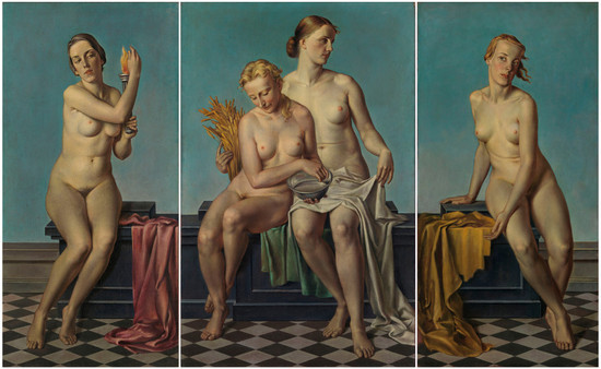
I kept reading about this horrific disaster. Steve Jobs hated flat design. Of the 2 main Apple designers, one supported flat design and one opposed it. Guess which is which.


Hint, which looks like a modern psychopath and which looks like a human being from the past?
Here is an article that explains the story.
http://www.slate.com/articles/technolog ... apple.html
Hint, which looks like a modern psychopath and which looks like a human being from the past?
Here is an article that explains the story.
http://www.slate.com/articles/technolog ... apple.html


-
fschmidt
- Elite Upper Class Poster
- Posts: 3470
- Joined: May 18th, 2008, 1:16 am
- Location: El Paso, TX
- Contact:
Re: Avoid OS X Yosemite
Guess the author of each painting.

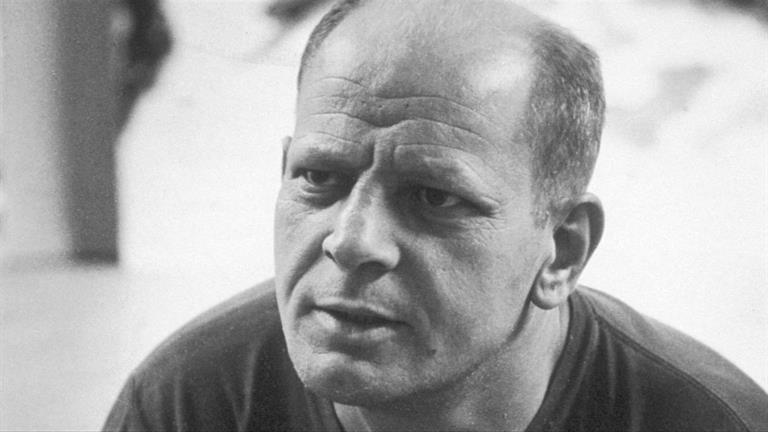
Notice the resemblance between the second painter and the designer of Yosemite? Both modern psychopaths.
Notice the resemblance between the second painter and the designer of Yosemite? Both modern psychopaths.
Re: Avoid OS X Yosemite
This is an interesting topic.
I don't plan to upgrade to Yosemite but this is more due to laziness. There are unfortunately some design programs or plugins that for whatever reason only work with the latest Mac OS. I’ll probably hit a problem eventually.
I'm not sure I agree with you on everything. These are my thoughts on the subject.
First I can forgive medievil art for being primitive because that was due to lack of understanding perspective. It was not a flagrant attempt to revert to something that required less technical skill. There were attempts to do perspective but they all looked funny. I don’t think it’s fair to compare a medieval artist’s intent to someone like Andy Warhol.
You’ve framed this argument as realism vs abstraction. I think this is the wrong comparison. While it’s true that most modern art is abstract and most traditional art is realistic, this doesn’t explain the broader problem with modern creativity. I think the correct argument is how something looks vs how something feels.
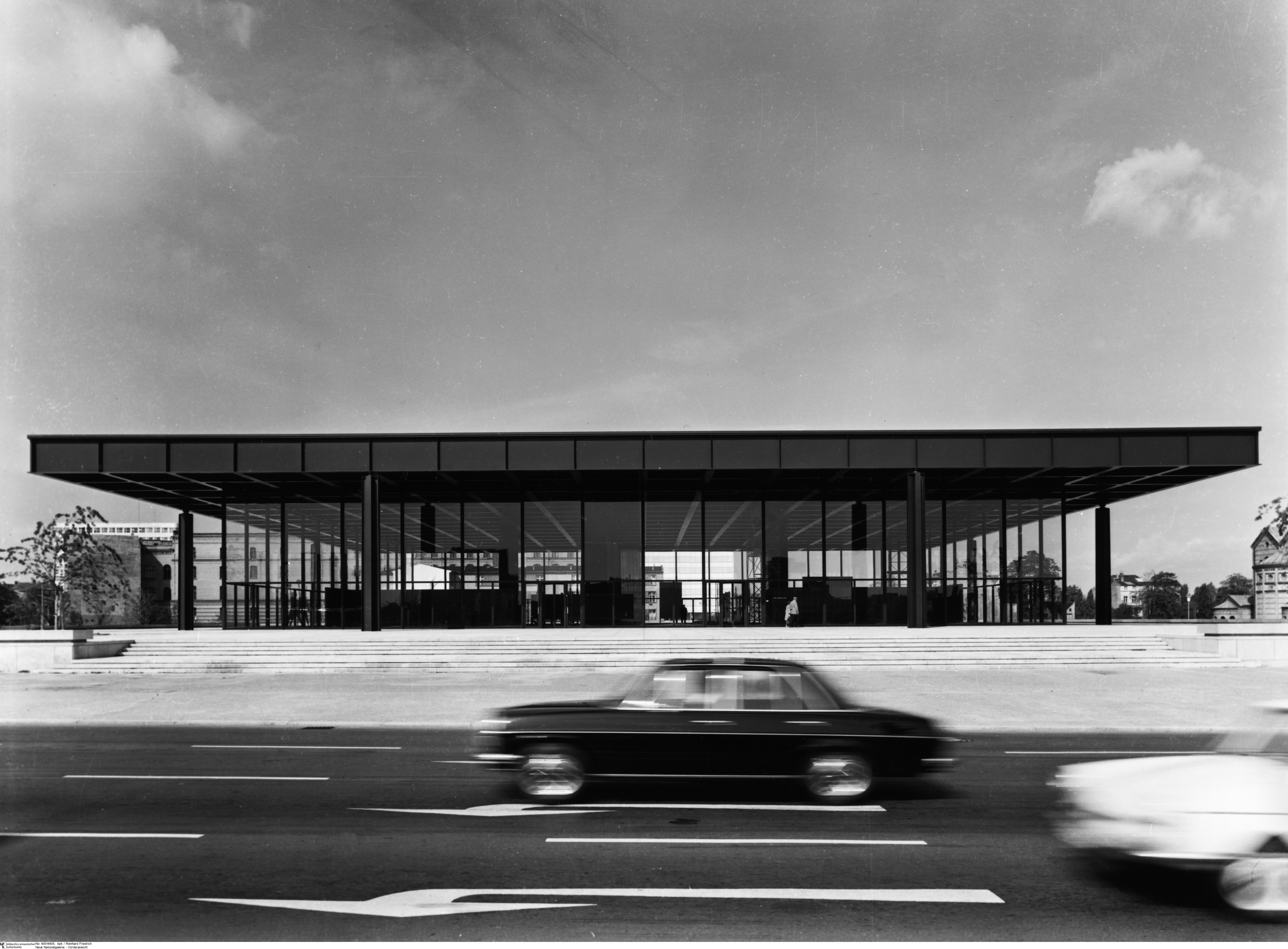
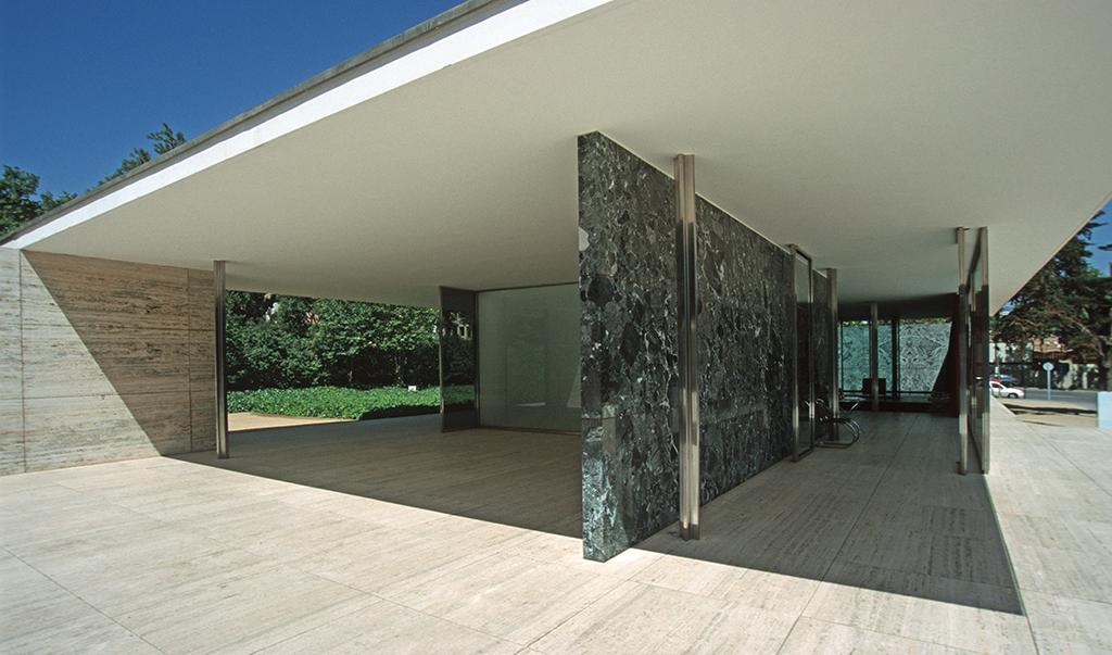
Modern art, design and architecture is notorious for valuing how something looks over how it feels. Architecture to me is the clearest example of this. Mies van der Roh produced buildings that arguably follow golden ratios and look perfectly symmetrical. To me his works are not buildings, they are instead massive sculptures with small doors and an inner chambers. His buildings are designed only for being looked at and that’s where my interest ends. They do not provoke a feeling to venture inside.
Yet if I take one look at an imperfect messy city like Guanajuato I instantly want to be there. This is because the city was designed with feeling in mind.

Architecture is a 3d medium and illustration is a 2d medium. Both modern architecture and modern illustration fail to evoke feeling, but what they’re missing is specific to their medium.
So what does modern architecture miss? First there is no attempt to integrate into the environment. The experience of being in a place is the sum of it’s parts, not any one structure. This is why old cities are nice and why modern cities are just a collection of individual buildings. With international style there is also no attempt to use local materials that blend into the natural landscape. Modern architecture also considers all structures of equal cultural importance. So in a modernist’s mind a presidential palace should look the same as shack. Lastly buildings are designed to look appealing from the perspective of a helicopter instead of from ground level. These are all problems specifically with architecture but they fall into the broader problem of failing to evoke feeling.
With modern illustration the problems are different but the end result is the same. An illustration is suppose to tell a story. When we look at a traditional painting we’re only seeing one page of the story, a snapshot in time. We don’t know what happened before or what will happen after, but it’s clear a story is being told and we’re reading it. When you illustrate a user interface you’re creating an interactive story. Each button, knob and switch is akin to a character that plays it’s role. All of these elements make a person feel like you’re partaking in a real story. This is why game designers have always drawn skeuomorphic interfaces from day one before there ever was such a name. Each interface element doesn’t just execute a function, it also evokes a feeling. Flat illustration doesn’t care about telling a story or triggering any emotions. It only cares about how the content looks.
On the other hand you can have something rendered perfectly realistically in a 3d program for months to look real and still fail to evoke any feeling.
Here's a 3d render of fruit:

Here's a painting of fruit.

The painting from a realism standpoint is technically inferior but in spite of this it evokes more feeling for me.
Skeumorphic design is similar to the second painting. It mimics perspective and real lighting, but it's still guilty of some level of abstraction. If skeumorphic design was judged only by realism it too would fall short.
Skeumorphism would fall short because skeuomorphic design’s main goal is making you feel a certain way. It doesn’t care about being accurate as long as it makes you feel a certain way. With skeumorphic design if they want to manipulate a shadow or create a highlight or tweak the perspective a little to get the right feeling they will deviate from realism.
The same can be said of the fruit painting. You will never see most lighting effects in the real world. These are exaggerated to make something more obvious. Since both the painting and skeuomorphic design are created in a dimension that can ignore real laws of light and perspective this gives leeway to manipulate the most important details.
So for art to not be a slave of reality some level of abstraction is always needed. However this requires a careful balance. If you tip the imagination scale too much, you end up with what Hitler would call degenerate art. Many paintings in Hitler’s 1937 degenerate art exhibit were Expressionist works with highly distorted shapes. When you push this further you end up Abstract Expression, which was an American derivative that was even one step more abstract.
I think a key reason why Jony Ives failed on the interface front is because he didn’t understand the “inter” in “interface”. Instead he just designed a “face”. Also in a 3d medium like industrial design you can have “flat” design and still express yourself through materials. So if you have something like a table, it makes a big difference whether it’s made out of gold, glass, stone or wood. The same cannot be said for a 2d medium, especially a digital 2d medium, where the only material is pixels.
On a practical side, there are some things that I do think are reasonable for flat design. The less pixels you have to work with, the simpler an icon needs to be. Creating a shadow or edge requires quite a lot of pixels. A favicon, which can be 16x16 pixels is an example of this. I don’t have any problem with things like the bar signals on my phone. In my gmail, I’m fine with just text. I don’t need to be wowed with textures everytime I write or read an email. From a programmatic standpoint I would think flat design is much easier for web pages and apps. Since most of flat design is just single solid colors buttons can be drawn without needing an image asset.
I don't plan to upgrade to Yosemite but this is more due to laziness. There are unfortunately some design programs or plugins that for whatever reason only work with the latest Mac OS. I’ll probably hit a problem eventually.
I'm not sure I agree with you on everything. These are my thoughts on the subject.
First I can forgive medievil art for being primitive because that was due to lack of understanding perspective. It was not a flagrant attempt to revert to something that required less technical skill. There were attempts to do perspective but they all looked funny. I don’t think it’s fair to compare a medieval artist’s intent to someone like Andy Warhol.
You’ve framed this argument as realism vs abstraction. I think this is the wrong comparison. While it’s true that most modern art is abstract and most traditional art is realistic, this doesn’t explain the broader problem with modern creativity. I think the correct argument is how something looks vs how something feels.
Modern art, design and architecture is notorious for valuing how something looks over how it feels. Architecture to me is the clearest example of this. Mies van der Roh produced buildings that arguably follow golden ratios and look perfectly symmetrical. To me his works are not buildings, they are instead massive sculptures with small doors and an inner chambers. His buildings are designed only for being looked at and that’s where my interest ends. They do not provoke a feeling to venture inside.
Yet if I take one look at an imperfect messy city like Guanajuato I instantly want to be there. This is because the city was designed with feeling in mind.
Architecture is a 3d medium and illustration is a 2d medium. Both modern architecture and modern illustration fail to evoke feeling, but what they’re missing is specific to their medium.
So what does modern architecture miss? First there is no attempt to integrate into the environment. The experience of being in a place is the sum of it’s parts, not any one structure. This is why old cities are nice and why modern cities are just a collection of individual buildings. With international style there is also no attempt to use local materials that blend into the natural landscape. Modern architecture also considers all structures of equal cultural importance. So in a modernist’s mind a presidential palace should look the same as shack. Lastly buildings are designed to look appealing from the perspective of a helicopter instead of from ground level. These are all problems specifically with architecture but they fall into the broader problem of failing to evoke feeling.
With modern illustration the problems are different but the end result is the same. An illustration is suppose to tell a story. When we look at a traditional painting we’re only seeing one page of the story, a snapshot in time. We don’t know what happened before or what will happen after, but it’s clear a story is being told and we’re reading it. When you illustrate a user interface you’re creating an interactive story. Each button, knob and switch is akin to a character that plays it’s role. All of these elements make a person feel like you’re partaking in a real story. This is why game designers have always drawn skeuomorphic interfaces from day one before there ever was such a name. Each interface element doesn’t just execute a function, it also evokes a feeling. Flat illustration doesn’t care about telling a story or triggering any emotions. It only cares about how the content looks.
On the other hand you can have something rendered perfectly realistically in a 3d program for months to look real and still fail to evoke any feeling.
Here's a 3d render of fruit:
Here's a painting of fruit.
The painting from a realism standpoint is technically inferior but in spite of this it evokes more feeling for me.
Skeumorphic design is similar to the second painting. It mimics perspective and real lighting, but it's still guilty of some level of abstraction. If skeumorphic design was judged only by realism it too would fall short.
Skeumorphism would fall short because skeuomorphic design’s main goal is making you feel a certain way. It doesn’t care about being accurate as long as it makes you feel a certain way. With skeumorphic design if they want to manipulate a shadow or create a highlight or tweak the perspective a little to get the right feeling they will deviate from realism.
The same can be said of the fruit painting. You will never see most lighting effects in the real world. These are exaggerated to make something more obvious. Since both the painting and skeuomorphic design are created in a dimension that can ignore real laws of light and perspective this gives leeway to manipulate the most important details.
So for art to not be a slave of reality some level of abstraction is always needed. However this requires a careful balance. If you tip the imagination scale too much, you end up with what Hitler would call degenerate art. Many paintings in Hitler’s 1937 degenerate art exhibit were Expressionist works with highly distorted shapes. When you push this further you end up Abstract Expression, which was an American derivative that was even one step more abstract.
I think a key reason why Jony Ives failed on the interface front is because he didn’t understand the “inter” in “interface”. Instead he just designed a “face”. Also in a 3d medium like industrial design you can have “flat” design and still express yourself through materials. So if you have something like a table, it makes a big difference whether it’s made out of gold, glass, stone or wood. The same cannot be said for a 2d medium, especially a digital 2d medium, where the only material is pixels.
On a practical side, there are some things that I do think are reasonable for flat design. The less pixels you have to work with, the simpler an icon needs to be. Creating a shadow or edge requires quite a lot of pixels. A favicon, which can be 16x16 pixels is an example of this. I don’t have any problem with things like the bar signals on my phone. In my gmail, I’m fine with just text. I don’t need to be wowed with textures everytime I write or read an email. From a programmatic standpoint I would think flat design is much easier for web pages and apps. Since most of flat design is just single solid colors buttons can be drawn without needing an image asset.
-
fschmidt
- Elite Upper Class Poster
- Posts: 3470
- Joined: May 18th, 2008, 1:16 am
- Location: El Paso, TX
- Contact:
Re: Avoid OS X Yosemite
I haven't framed this argument as realism vs abstraction. Where did I say anything about "abstract"? I have nothing against sensible abstractions.
I also don't think the issue is how something looks vs how something feels. Yosemite both looks bad and feels bad.
I posted this article on CoAlpha recently:
http://pjmedia.com/lifestyle/2012/10/31 ... one-photo/
This directly gets to the real issue. The issue is evil itself. Modern culture is a celebration of evil and all it entails including ugliness and dysfunctionality. To be edgy means nothing more than to make a significant move in the direction of evil. Moving from a renaissance style to a medieval style is regression in every way including both realism and aesthetics. So such a move is evil. I am not blaming medieval artists, they were limited in what they could do. But to intentionally choose the primitive over the classical is simply evil.
In English, we have the distinct words "evil" and "bad". This is a false distinction. In Hebrew and in Spanish, there is only one word that encapsulates both. Modern culture is evil/bad. Ugliness and dysfunctionality inevitably go together in the long run. Having spent a few days using Yosemite now, I see it has far more bugs and is less stable the Mavericks. No accident.
Modern culture mocks beauty, mocks intelligence, mocks functionality, mocks everything that is good in the world. This is because it is pure evil. And Yosemite is just the latest example that I have seen of this trend.
-
E Irizarry R&B Singer

- Elite Upper Class Poster
- Posts: 3113
- Joined: April 18th, 2013, 5:26 pm
Re: Avoid OS X Yosemite
My iPad is trying to auto-update it's iOS to 7.1.1+, which just begun anti-jailbreaking. It's begging me to upgrade, let no updates allowed, and I let that icon stick at "General 1" lol
-
E Irizarry R&B Singer
- Elite Upper Class Poster
- Posts: 3113
- Joined: April 18th, 2013, 5:26 pm
Re: Avoid OS X Yosemite
...and now I cannot do MAC changing anymore at 7.1.1 and above. For fck's sake.
Re: Avoid OS X Yosemite
You didn't say anything about "abstact" but you showed a realistic and abstract painting and I assumed this was what you were comparing.fschmidt wrote:I haven't framed this argument as realism vs abstraction. Where did I say anything about "abstract"?
I'm curious what you consider a sensible abstraction. For the most part abstraction in the context of an interface doesn't bother me as long as it's aided by other information. I do think skeuomorphic design works better with representing clear nouns (calculator, clock, etc). It's much more challenging to create readily identifiable skeuomorphic designs for adjectives (fast, slow, brighter, darker).fschmidt wrote:I have nothing against sensible abstractions.
I don't have it so I can't judge how it feels. I found this screenshot on the dock:fschmidt wrote:I also don't think the issue is how something looks vs how something feels. Yosemite both looks bad and feels bad.

Yes they have less detail, some icons look more crude. The system preferences glares out to me. The itunes/appstore/books icon are already fairly detail free, I think they look cleaner now. I don't know what the yellow icon or dotted icon is, which is bad. In general I don't think something is automatically ugly because it's less detailed. For example I can appreciate a nice harmony of colors just by themselves:


The contrast in that article is more obvious. The pink lady is clearly technically a step back. But what about modern statues that are ugly but technically sophisticated? For example search "modern realistic sculpture".fschmidt wrote:I posted this article on CoAlpha recently:
http://pjmedia.com/lifestyle/2012/10/31 ... one-photo/
-
fschmidt
- Elite Upper Class Poster
- Posts: 3470
- Joined: May 18th, 2008, 1:16 am
- Location: El Paso, TX
- Contact:
Re: Avoid OS X Yosemite
Math and computer science have plenty of sensible abstractions. But for an aesthetic example that you can see, try Islamic art. Islamic art is completely abstract and I find it very attractive.drealm wrote:I'm curious what you consider a sensible abstraction.
A screenshot can't do it justice. You have to use it. After a few days, my brain is adjusting, but initially I didn't understand what I was looking at. I had to think to figure out where one window ends and another begins because the visual clues were gone. That is the essence of Yosemite, the removal of visual clues that make things understandable. Instead, your brain must adjust to their visual language, and that is evil.I don't have it [Yosemite] so I can't judge how it feels. I found this screenshot on the dock:
Perfectly illustrates my point. What is common to modern culture is ugliness and dysfunctionality, not abstraction.But what about modern statues that are ugly but technically sophisticated? For example search "modern realistic sculpture".
Re: Avoid OS X Yosemite
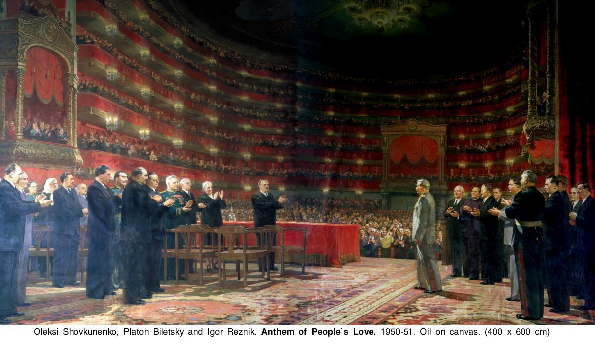
Totalitarian regimes provide an interresting view into art:


-
fschmidt
- Elite Upper Class Poster
- Posts: 3470
- Joined: May 18th, 2008, 1:16 am
- Location: El Paso, TX
- Contact:
Re: Avoid OS X Yosemite
Yes, I would call it failed beauty and realism. Abstraction is dangerous to totalitarianism. They would like beauty to back their regime and they understand what beauty is, but they can't produce it. This is still far better than modern culture which strives for evil and achieves it.drealm wrote:Totalitarian regimes provide an interresting view into art:
-
The_Adventurer
- Experienced Poster
- Posts: 1383
- Joined: August 23rd, 2007, 9:17 am
Re: Avoid OS X Yosemite
They're just unifying everything so it looks the same as iPad and iPhone. Is it really tge end of the world?
“Booty is so strong that there are dudes willing to blow themselves up for the highly unlikely possibility of booty in another dimension." -- Joe Rogan
-
- Similar Topics
- Replies
- Views
- Last post
-
- 3 Replies
- 2291 Views
-
Last post by Rumaaa
-
- 8 Replies
- 4748 Views
-
Last post by Tsar
-
- 55 Replies
- 30056 Views
-
Last post by Natural_Born_Cynic
-
- 38 Replies
- 17453 Views
-
Last post by Zambales
-
- 3 Replies
- 3709 Views
-
Last post by Moretorque